AI Slides: 10 Designer Themes and a New Setup
AI Slides now has ten designer themes you pick by looking at real slides, an outline you can edit before the deck is made, new teaching slides, and a setup that remembers your last deck.

Short answer: Scholarly's AI Slides now offers ten designer themes, from a fashion editorial look to a neon startup keynote and a technical blueprint. Each theme brings its own fonts, colors, background art, and layouts that use the whole slide. You choose one from a gallery of real slides at the top of the Slides settings, on every plan, including Free. Before the deck is made, you can now review its outline: rename, reorder, add, or remove slides, then create exactly that deck. Planning the outline is free. New teaching slides add worked examples, corrected misconceptions, check-your-understanding questions, and a recap that says where to review each point.
A deck made from your own material should look like someone designed it. Until now, most AI Slides decks shared one house design in different colors, and the color choice sat in a small menu at the bottom of the settings, so most people never changed it. Two decks on different subjects could look almost the same.
There was a second problem: you only saw what the AI planned once the deck was finished. If it spent three slides on a part you did not need, the only fix was to make the deck again.
This update fixes all of that: better designs, a setup that puts them in front of you, and a look at the plan before anything is made.
The short version
- Ten designer themes. Atelier, Swiss Grid, Launch, Studio, Botanica, Riso, Noir, Neon, Blueprint, and Velvet. Each is a complete design with its own pair of typefaces.
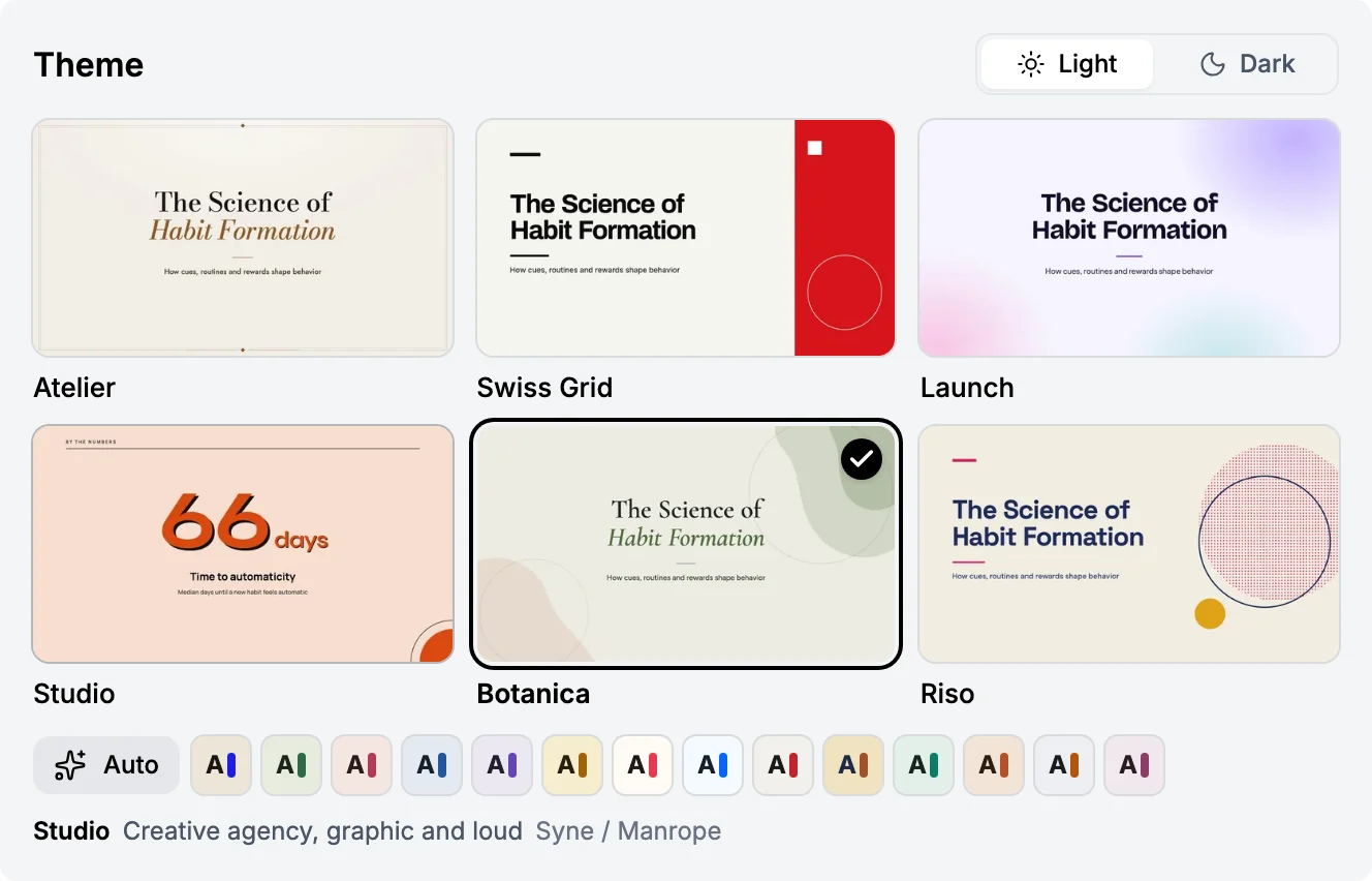
- Choose from real slides. The Slides settings now open with a theme gallery. Point at a theme to see a second slide in it before you create.
- Review the outline first. See every planned slide's headline and what it will teach, edit the list, then create exactly that deck. Planning it is free.
- Layouts that fill the frame. Lists, steps, timelines, charts, tables, comparisons, and pictures now use the slide instead of sitting in a band across the middle.
- New slide types. Numbered section dividers and key figures, plus four teaching slides: worked examples, misconceptions, checks, and recaps.
- A shorter path to Create. Expert styles are now one row under the deck style, and your last deck's settings come back on their own.
- Start later. Schedule a deck for a set time, or after your current creation.
Ten designer themes
Every designer theme changes the whole deck: the fonts, the palette, the background art, the title slide, and how each kind of slide is laid out. The content never changes. The same source produces the same explanations, figures, and speaker notes in any theme.
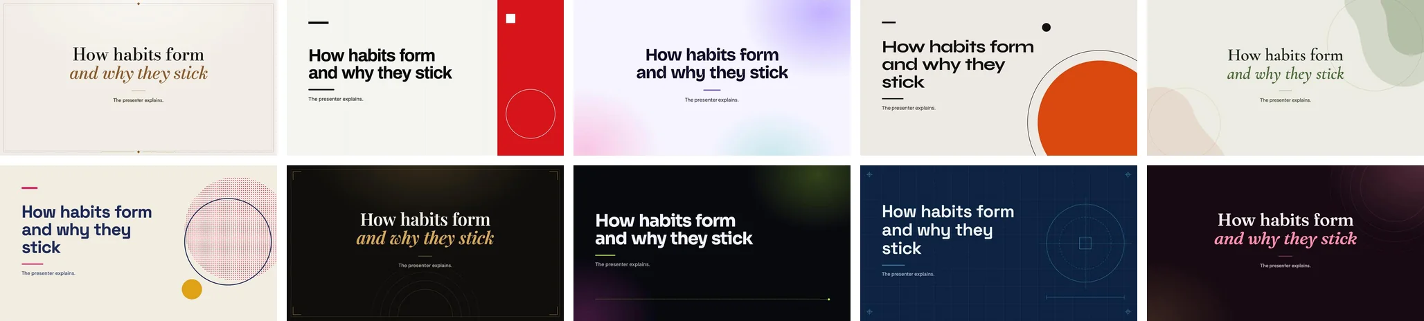
Six themes are light and four are dark:
| Theme | Light or dark | The feel |
|---|---|---|
| Atelier | Light | Luxury fashion editorial, set in Bodoni Moda and Jost |
| Swiss Grid | Light | International style, bold and gridded, set in Archivo and Inter |
| Launch | Light | Product launch and marketing, set in Bricolage Grotesque and Plus Jakarta Sans |
| Studio | Light | Creative agency, graphic and loud, set in Syne and Manrope |
| Botanica | Light | Calm, organic and refined, set in Cormorant Garamond and Figtree |
| Riso | Light | Risograph zine, playful print, set in Space Grotesk and DM Sans |
| Noir | Dark | Black-tie luxury, set in Playfair Display and DM Sans |
| Neon | Dark | Startup keynote, high voltage, set in Sora and Inter |
| Blueprint | Dark | Engineering and technical, set in Space Grotesk and IBM Plex Sans |
| Velvet | Dark | Warm, cinematic and bold, set in Fraunces and Outfit |
The fourteen light and five dark color looks are still there for a quieter deck, and Auto still picks one of them for you.
Layouts that fill the frame
The most common problem we saw in AI decks, ours included, was small text in an empty slide. A list of four points sat in a strip across the middle, and the rest of the slide was blank. A deck like that is hard to read on a projector and easy to skim past when you study from it.
Designer themes now lay out each kind of slide to use the space:
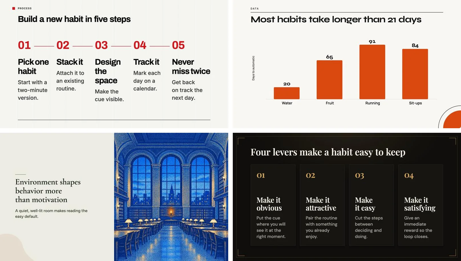
- Lists become cards that fill the area, or large ruled rows when the points are short.
- Steps run along a drawn rail, numbered in the theme's display face.
- Pictures bleed off the edge across half the slide, beside a large headline.
- Bar charts carry each value on its bar, so the bars can fill the plot.
- Tables, comparisons, diagrams, equations, and mind maps grow to take the room they used to leave empty.
- Key ideas, definitions, theorems, and callouts are set at poster size.
Each layout starts its type large and steps down only as far as the words need. A short slide fills the frame, and a long one still fits without spilling out of its box.
New slide types
- Section dividers number the parts of a long deck, so a 25-slide training session or lecture has clear chapters.
- Key figures put two to four numbers side by side with a short label under each, for the results slide every report deck needs.
Four more slide types are built for teaching, the parts of a lesson that a list of bullet points does badly:
- Worked example: the problem as given, the steps in order, and the answer they reach.
- Misconception: a common wrong belief struck through, then what is actually true and why.
- Check your understanding: one question, usually with two to four choices, and its answer.
- Recap: the takeaways to remember, each with the page or section of your source to review it in.
A deck now usually ends on a recap, so the last slide tells you what to go back to. All six work in every theme and every color look, and AI Slides chooses them when the material calls for them. You will see the teaching slides in AI video lectures too, where a check-your-understanding question pauses for you to think before the answer is spoken.
Neighboring slides also stop repeating one another. Three lists in a row used to look identical; now the middle one changes shape, so you can tell where you are in the deck at a glance.

A new setup step
The Slides settings have been rearranged around the choice that changes your deck the most.
Theme comes first. The gallery shows each designer theme as its real title slide. Point at one and a second slide in that theme fades in, and the line underneath names its mood and typefaces. A Light and Dark switch beside the heading changes which themes you see. Under the cards, Auto and the color looks sit in one row of swatches.
The rest is shorter. Pick a starting preset (Full Deck or Exam Prep). Under it, the optional expert styles (Executive Assertion-Evidence, Visual Teaching Deck, and Minimalist Keynote) are now one row of names with one line describing the style you point at. Settings keeps the slide count, the language, and the AI model.
Your last deck comes back. After you create a deck, AI Slides remembers your preset, expert style, slide count, theme, and dark mode. The next time you open it, you will see Using your last settings, and Reset takes you back to the defaults. Your typed instructions are never saved. If you make a deck every week for the same class or team, you can now go from source to Create in a couple of clicks.
Start later. Under Advanced options, Schedule starts the deck at a set time, or after the creation you are already running. A scheduled deck skips the outline review.
Review the outline before it is made
The button at the bottom of the Slides settings now reads Review outline. Press it, and AI Slides plans the deck first and shows it as a list: each slide's headline and a note on what it will teach. Planning takes about a minute and costs nothing. Your AI Creation Credit is used only when you create the deck.
While you look it over, you can:
- Rename a slide, or rewrite what it should teach.
- Drag slides into a different order.
- Add a slide, or remove one you do not need.
- Ask for a slide type, such as a chart, a timeline, a comparison, or a definition. Leave it on Auto and AI Slides chooses.
When it looks right, press Create (the button shows how many slides you will get), and AI Slides builds exactly that deck. A slide you leave alone is built just as it would have been without the review. On Free, the outline can grow to 10 slides; Premium and Laureate go up to 30.
If you would rather go straight to the deck, turn off Review outline first at the bottom of the settings, and Create makes the deck in one step, as before. You can also press Create without review while the outline is being planned.
On your phone
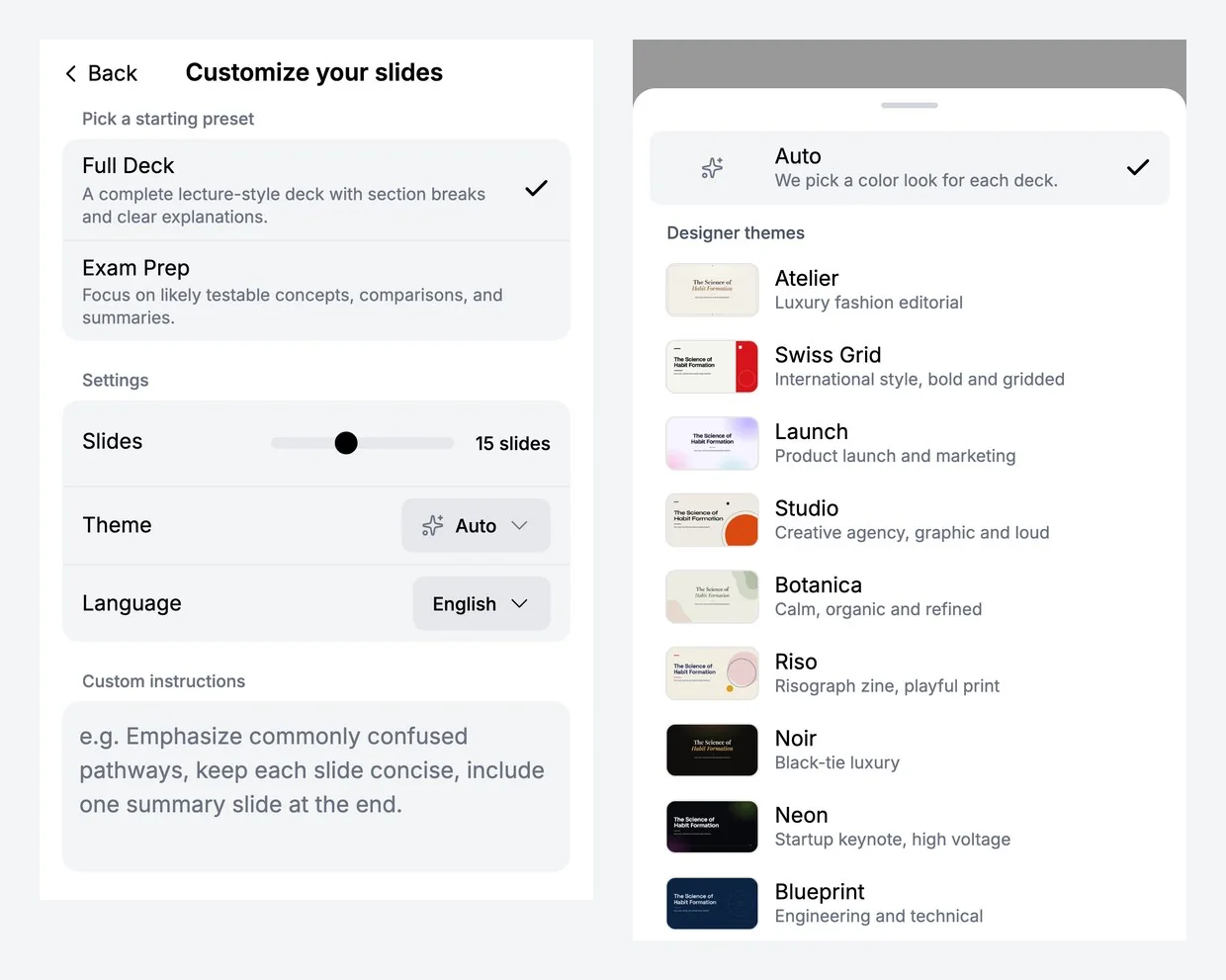
Phones keep the core choices, so the step stays one short screen. Theme is a row in Settings. Tap it to open a sheet with Auto and every designer theme, each with a preview and a one-line description. Picking Noir, Neon, Blueprint, or Velvet gives you a dark deck.
The outline works on a phone too. It is a simple list of slides; tap one to edit its headline, note, and type on its own screen, or to move or remove it. One button at the bottom creates the deck.
Which theme for which deck
A few starting points:
- Studying on your own: Botanica or Swiss Grid keep long reading calm and clear. A quiet color look such as Classic works too.
- Presenting in class or to a study group: Launch or Studio carry a room.
- Engineering, computer science, or a technical walkthrough: Blueprint.
- Art history, literature, or design: Atelier, Botanica, or Velvet.
- A pitch, demo day, or product update: Neon or Launch.
- Onboarding or training slides for a team: Swiss Grid reads clearly on a shared screen, and every trainer's deck can use the same theme.
If you are not sure, try two. The content is the same in every theme, so the only difference is how it looks.
How to make a deck
- Open Scholarly and choose AI Slides on Home, or Slides from the New menu.
- Add your source: a PDF (you can pick a page range), notes, a recording, a link, or a topic.
- Pick a theme from the gallery, or leave it on Auto.
- Set the number of slides: 5 to 30 on Premium and Laureate, 10 on Free.
- Add instructions if you want to steer the content, then press Review outline.
- Edit the planned slides if you want, and press Create. You can also schedule the deck for later from Advanced options.
Every deck still comes with speaker notes on every slide, written from your source, and on a paid plan the PowerPoint download keeps each slide's design and puts the notes in PowerPoint's notes pane.
For every setting on the Slides step, see the AI Slides guide. For more on each theme, see Slide Themes. To start from a specific file, try PDF to PowerPoint or the AI Slide Generator. The same source can also become a narrated AI video lecture. For how AI Slides builds a deck, read AI Slides, Rebuilt: Decks With Speaker Notes.